Digital Marketing Services
Learn More About Us

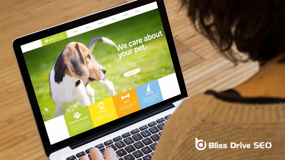
When optimizing a landing pageThe web page a user is directed to after clicking on an affiliate link, optimized for conversions., you'll want to start by understanding your target audience to address their specific needs. Next, define a clear primary call to action that captures attention and confirms it's consistent with your campaign's message across all touchpoints. Craft compelling headlines that speak directly to user intent and optimize visual elements to maintain engagementThe interactions that users have with a brand’s content on social media.. Simplify your layout for clarity, and use white space effectively to guide focus. Don't forget to incorporate social proofThe influence that other people’s actions have on one's own behavior, often seen in likes, shares,... to build credibility. Lastly, ongoing A/B testingA method of comparing two versions of a web page or app against each other to determine which one pe... is pivotal for refining and improving performance. But how do you confirm each element works harmoniously?

Understanding your target audience is pivotal for effective landing page optimizationImproving the design and content of a landing page to increase conversions.. To begin, identify your visitor's main questions and pain points. This allows you to design an experience that caters directly to their needs. By prioritizing these questions and needs, you avoid distractions and repetitions, keeping your landing page streamlined and focused.
When considering the primary call to action, make sure that the rest of your content supports and drives visitors toward this goal. Matching landing page aesthetics with campaignA set of ad groups sharing a budget, targeting options, and other settings. sources is vital. Consistency here minimizes bounces and maintains a seamless user journey from the ad to the landing page.
Customizing pages for different devices is another key aspect. Pay attention to common visitor devices to create mobile-responsive designs. This guarantees a smooth experience, regardless of how someone accesses your site. Tailoring your landing pages based on these devices can notably enhance user satisfaction and engagement.
Ultimately, knowing your target audience helps you customize pages that address their specific pain points and questions. By doing so, you create a matching landing page that aligns with your campaign sources, making your visitors more inclined to engage with your primary call to action.
Wondering how to guide your visitors towards the desired action? Defining a clear and prominent primary call to action (CTA)A prompt that encourages users to take a specific action, such as "Buy Now" or "Sign Up." is vital for effective landing page optimization. Your primary CTA should be the main focal point of your page, free from distractions that might divert visitors' attention elsewhere.
By making your CTA visually stand out and communicating a compelling message, you greatly enhance the chances of visitors taking the desired action.
A strong primary CTA can profoundly impact your conversionThe completion of a desired action by a referred user, such as making a purchase or filling out a fo... rates and overall campaign success. To achieve this, design your landing page so that the primary CTA is immediately noticeable. Use contrasting colors, bold fonts, and strategic placement to guarantee it catches the eye.
The message should be clear, concise, and compelling, leaving no uncertainty about what action you want visitors to take.
To keep users engaged and reduce bounce rates, maintain your brandingThe process of creating a unique name, design, and image for a product or service in the consumer's ... consistently across all campaign entry points.
Your landing page's design and messaging should align with the source of your campaign for a cohesive experience.
This seamless journey not only builds trust but also boosts your conversion rates.
Matching your landing page design with the aesthetics of your campaign sources is crucial for minimizing bounce rates. By ensuring consistent branding across all campaign entry points, you enhance brand recognitionThe ability of consumers to identify a brand by its attributes, such as logo, color, or packaging. and foster trust with your audience. When your landing page mirrors the look and feel of your campaign sources, visitors are more inclined to interact with your content, increasing the likelihood of conversion.
Think about it: when users click through an ad or email, they anticipate seeing a smooth progression to your landing page. Consistent brand messagingThe communication and language used to convey a brand's values, benefits, and personality. and visuals create a seamless brand experienceThe total impression a consumer has of a brand based on their interactions with it., improving user experience and enticing visitors to stay longer. This alignment directly influences your conversion rates, as a unified look and feel reassures visitors that they're in the right place.
Furthermore, a seamless brand experience from campaign to landing page can result in higher conversion rates. When everything feels interconnected, users are more inclined to take action, whether it's subscribing to a newsletterA regularly distributed email containing news, updates, and content relevant to subscribers. or completing a purchase.
Therefore, concentrate on maintaining a cohesive design and message across all your campaign sources and landing pages to drive visitor engagement and achieve superior outcomes.
When it comes to optimizing your landing pages, aligning their design with the aesthetics of your campaign sources can make or break your success. An aesthetic match-up ensures that visitors shifting from your ads to your landing page experience consistent branding and messaging, which is vital for trust-building and user engagementThe level of interaction and involvement users have with social media content.. This consistency across all campaign entry points not only enhances credibility but also boosts conversion rates significantly.
Here are three essential tips for achieving aesthetic match-up:
Amid the fast-moving world of digital marketing, crafting clear headlines is vital. Since 80% of visitors only read headlines, you need to make sure your message is concise and compelling. Focus on creating benefit-driven headlines that directly address your visitors' needs. When your headlines resonate with user intent, you can observe up to a 90% increase in engagement.
Incorporating power words and action-oriented language is essential. These elements can enhance your click-through rates by up to 13%, as they create a sense of urgency or excitement. Don't hesitate to use words that evoke strong emotions or demand action.
For example, words like:
can make a notable difference.
A/B testing different headline variations is crucial to finding what works best for your audience. This method can leadA potential customer referred by an affiliate who has shown interest in the product or service but h... to a 30% higher conversion rateThe percentage of visitors who complete a desired action, such as making a purchase or filling out a..., helping you identify the most effective headlines.
Additionally, make sure your headlines align with your ad messaging. Consistency and relevance between your headlines and ads drive a 25% higher conversion rate compared to mismatched messaging. By focusing on these strategies, you can optimize your landing page and notably enhance your conversion rates.

Optimizing visual elements on your landing page can greatly enhance engagement and conversions. To make your landing page visually appealing and effective, focus on these key strategies:
Additionally, make sure that your visual elements support the overall message and improve user experience. Test different visuals such as hero images, product photos, and video thumbnails to determine which ones have the most impact.
Visual data reports can also be used to analyze engagement and conversion rates, helping you make informed decisions. By focusing on these strategies, you'll create a landing page that not only looks good but also performs excellently.
While optimizing visual elements greatly improves engagement, making sure your landing page is mobile-friendly is equally important. With 52.2% of website traffic coming from mobile devices, mobile optimizationDesigning and formatting web content to ensure it performs well on mobile devices. is non-negotiable. The responsive design guarantees your site looks and functions well on any device, directly affecting user perception and retention.
A mobile-friendly landing page can greatly boost conversions by 103%, making it vital to cater to mobile users. Remember, 57% of users won't recommend a business with a poorly designed mobile site. Hence, enhancing mobile responsiveness not only improves user experience but also strengthens your brand's reputation.
Google's mobile-first indexingGoogle’s practice of using the mobile version of a website for indexing and ranking. means that mobile-friendly sites are prioritized in search engine results. By focusing on mobile optimization, you can improve your search engine visibility and attract more organic trafficVisitors who come to a website through unpaid search engine results..
Importantly, 61% of users are unlikely to return to a site that's not optimized for mobile, making it crucial for retaining visitors and driving conversions.
A clean and straightforward layout can greatly enhance your landing page's effectiveness. By focusing on layout simplification, you create a better user experience and drive higher conversion rates. Here are some key strategies for optimizing your landing page design:
A strong, prominent call-to-action button is essential. It should stand out visually and prompt visitors to take immediate action.
Building on the importance of a simplified layout, the effective use of white space can greatly enhance your landing page's user experience. White space, or negative space, isn't just about creating a cleaner look; it plays a critical role in guiding your visitors' focus and attention.
By strategically placing white space around key elements like headlines and calls-to-action (CTAs), you can increase user attention and focus up to a substantial extent.
Moreover, white space provides essential visual breathing room, making your content easier to read and comprehend. Studies show that proper use of white space can boost reading comprehension by up to a noteworthy percentage, helping visitors absorb information more effectively.
This reduces cognitive overload, allowing users to process content without feeling overwhelmed, thereby enhancing their overall experience on your page.
Additionally, the aesthetic appeal of well-utilized white space can't be overlooked. An uncluttered layout not only looks more professional but also improves user retention rates by up to a significant degree.
Visitors are more likely to stay and engage with your content when they're not distracted by clutter. In sum, incorporating white space effectively can substantially elevate your landing page, making it both visually appealing and highly functional.

Leveraging social proof can greatly enhance your landing page's effectiveness. When visitors see customer testimonialsPositive statements from customers about their experiences with a product or service, used to build ..., reviews, or case studiesIn-depth analyses of specific instances or examples to highlight success stories or lessons learned...., it builds trust and credibility. This reassurance makes them more likely to take action, boosting your conversion rates.
To effectively use social proof on your landing pages, consider these strategies:
When you implement ongoing A/B testing, begin by testing single variable changes like various headlines or CTAs to see what drives conversions.
Analyzing conversion rate data from these tests will help you understand what's effective and what's not.
This approach guarantees you make informed, data-driven decisions that can greatly enhance your landing page's performance.
Success in landing page optimization often hinges on the clarity and precision of your testing methods. Continuous A/B testing, focusing on single variable changes, is a powerful approach to secure accurate measurement of each element's impact on conversion rates. By isolating just one variable, like a headline or CTA, you can identify its specific effect on your landing page performance.
This method offers several advantages:
Elements testing this way prevents confusion from multiple modifications at once, providing a straightforward path to effective landing page optimization. Each test builds on the last, creating a robust framework for maximizing conversions.
Analyzing conversion rate data through continuous A/B testing is essential for optimizing your landing page. By diving into this data, you can uncover high-performing elements to replicate and low-performing aspects to improve. Continuous A/B testing has the potential to boost your conversion rates by up to 300%, making it a powerful tool in your optimization toolkit.
When you conduct A/B testing, you compare different landing page variations to see which ones perform better. This process allows for data-driven decision-making, ensuring you base your changes on real-time insights rather than guesswork.
Testing variations of elements like headlines, CTAs, and images helps you refine your landing page to maximize conversions.
How can using high-quality images and videos enhance a landing page?
What are the best strategies for optimizing call-to-action buttons?
How does mobile optimization affect landing page performance?
What role do testimonials and reviews play on a landing page?
By focusing on your audience's needs, making your primary call to action stand out, and ensuring campaign consistency, you can create a compelling landing page. Use clear headlines, engaging visuals, simple design, and effective white space to enhance user experience. Leverage social proof for credibility and continuously A/B test to refine your strategy. These tips will boost conversions and drive campaign success. Keep optimizing, and you'll see the results you're aiming for.
