
Digital Marketing Services

Learn More About Us

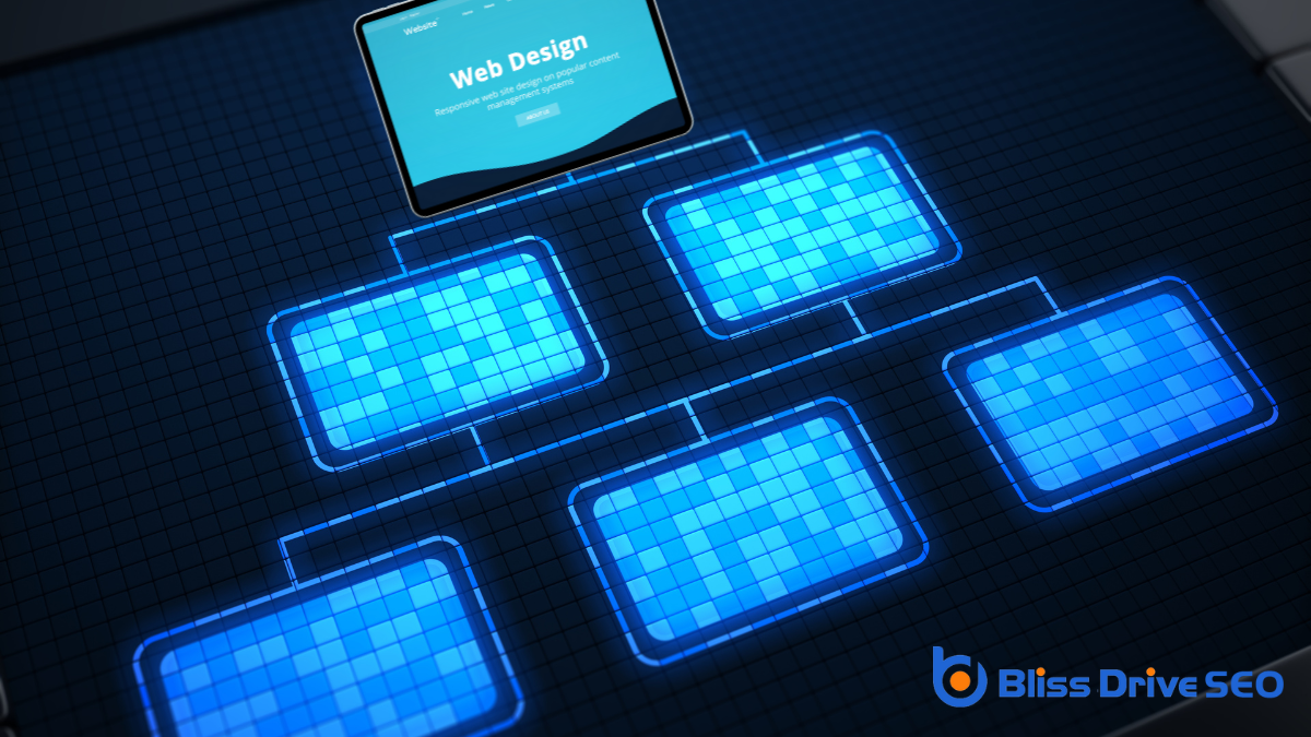
When you're designing a website, five golden rules can guide you toward creating a successful and engaging user experience. You should start by putting user needs at the forefront, ensuring your design is both intuitive and accessible. With the rise of mobile browsing, responsiveness is essential, and you can't overlook the importance of fast load times to keep users engaged. Clear navigation and a well-defined visual hierarchyThe arrangement of elements on a webpage in a way that guides users' attention to the most important... make finding information easier. But how do you balance engaging content with consistent brandingThe process of creating a unique name, design, and image for a product or service in the consumer's ...? There's much more to explore in mastering these principles.
When diving into user-centric designDesigning websites and applications with the needs and preferences of users in mind., empathy is your most valuable tool. You want to step into the users' shoes and understand their needs, frustrations, and desires. It's not just about creating something visually appealing; it's about designing an experience that genuinely resonates with your audience.
Begin by conducting thorough research. Talk to your users, gather feedback, and observe how they interact with your website. This will help you identify pain points and opportunities for improvement.
Next, focus on creating intuitive navigation. Users should effortlessly find what they're looking for without feeling overwhelmed. Keep things simple. Cluttered pages confuse users, so prioritize clean layouts and clear calls to action.
Also, consider accessibility. Confirm your design accommodates all users, including those with disabilities. This isn't just a checkbox to tick; it's about making your site usable for everyone.
Finally, test and iterate. User feedback is gold. After implementing changes, gather insights on how they impact the overall experience. Are users finding it easier to navigate? Are they engaging more with your content?
Use this feedback to refine and enhance your design continuously. Remember, user-centric design is an ongoing process, not a one-time task.

In today's digital landscape, guaranteeing your website is mobile responsive isn't just an option—it's a necessity. With the majority of internet users accessing sites via mobile devices, you can't overlook this vital aspect of web design. A mobile-responsive site adapts seamlessly to different screen sizes, offering a superior viewing experience whether someone uses a smartphone, tablet, or desktop.
When designing your website, consider how elements like text, images, and navigation will appear on smaller screens. If users have to pinch and zoom or scroll excessively, they'll likely leave your site in frustration.
Use responsive designA web design approach that makes web pages render well on a variety of devices and window or screen ... techniques such as flexible grids and layouts, as well as scalable images, to create a smooth, user-friendly experience.
Think about touch-friendly navigation too. Buttons and links should be easy to tap, with sufficient spacing to prevent accidental clicks. Testing your website on various mobile devices guarantees it performs well across the board.
Embracing mobile responsiveness not only enhances user satisfaction but also improves your site's search engine ranking. Many search engines prioritize mobile-friendly sites, so making your site responsive is also a smart strategy for visibility and reach.
Prioritize this to keep pace with evolving user expectations.
Fast load times are vital for keeping visitors engaged and satisfied with your website. If your site takes too long to load, users might leave before even seeing your content. To guarantee your site loads quickly, you'll want to optimize images by compressing them without losing quality. Large images can slow down your site, so using the right format and size is essential.
Use browser caching to store static files on visitors' devices. This way, returning visitors don't have to reload the same files, speeding up their experience. You can also minimize HTTP requests by combining files like scripts and stylesheets. Fewer requests mean faster load times.
Another key step is to use a content delivery network (CDN)A system of distributed servers that deliver content to users based on their geographic location.. A CDN distributes your site's content across various servers worldwide, reducing the distance data travels to reach users. This helps everyone enjoy faster access to your site.
Don't forget to enable gzip compression, which reduces the size of your site's files, making them quicker to transfer.
Regularly test your site's speed using tools like Google PageSpeed Insights to identify areas for improvement. By following these steps, you'll guarantee a fast-loading, user-friendly website.
When you're designing a website, focus on creating a simple menu structure that guides users effortlessly.
Use descriptive labels so visitors know exactly what to expect when they click.
Consistency in layout helps users find what they need without confusion, enhancing their overall experience.
Crafting intuitive navigation is essential for an effective web design. When you simplify your menu structure, you make it easier for visitors to explore your site without feeling overwhelmed.
Start by focusing on the most critical sections of your website. Identify the key areas you want users to access quickly, and limit the number of top-level menu items to avoid clutter.
Think about how users naturally look for information. Arrange your menu items in a logical order that aligns with their expectations. Categories should be clear and distinct, helping users find what they need without second-guessing.
A streamlined menu enhances user experience, encouraging visitors to stay longer and explore further.
Consider using dropdown menus for subcategories, but don't overdo it. Too many layers can leadA potential customer referred by an affiliate who has shown interest in the product or service but h... to frustration.
Test your menu with real users to verify it's intuitive and effective. If they can navigate your site with ease, you're on the right track.
It's also essential to maintain a user's trust by delivering on the promise of your labels.
If they click "Contact Us," they shouldn't end up on a blog post.
Descriptive labels help your visitors navigate with confidence and ease, keeping them engaged and satisfied.
Building on the importance of descriptive labels, a consistent layout is key to guiding users effortlessly through your website. When your site maintains a uniform structure, visitors know what to expect as they navigate from page to page. This predictability enhances user experience and reduces confusion, making it easier for them to find what they're looking for.
Start by keeping your primary navigation menu in the same location on every page. This strategy guarantees users don't have to search for how to move around.
Use the same font, color scheme, and button styles across your site. Consistency in design elements not only creates a cohesive look but also reinforces your brand identityThe visible elements of a brand, such as color, design, and logo, that identify and distinguish the ....
When designing a website, you need to focus on visual hierarchy to guide your users' attention effectively.
Prioritize key elements by making them larger or positioning them strategically, and use color contrast to highlight important features.
A well-designed website places importance on prioritizing key elements using a visual hierarchy to guide the user's eye seamlessly through the content. You need to make certain your website's most critical information stands out, capturing attention immediately.
Start by identifying the primary goals of your site. Whether it's a call-to-action button, a headline, or important visuals, these elements should be prominently featured.
Visual hierarchy helps users understand what's important at a glance. You can achieve this by varying sizes, weights, and positions of text and images. Larger and bolder elements naturally draw more attention, so use these to highlight essential information.
Positioning also matters—place crucial content where users are most likely to see it, such as the top or center of a page.
Consider the flow of information. Arrange elements logically, leading users through a clear path. Use whitespace strategically to separate sections and avoid clutter, making it easier for users to focus on what matters most.
To effectively guide users through your website's content, color contrast plays a pivotal role in establishing a clear visual hierarchy. By strategically using contrasting colors, you can highlight essential elements and direct your audience's attention where you want it. This technique helps readers easily differentiate between various sections, making your site more navigable and user-friendly.
Start by selecting a dominant color that aligns with your brand. Use this as the primary color for backgrounds or large areas. Then, choose contrasting colors to emphasize buttons, links, and calls to action. High contrast between text and background enhances readability, ensuring users don't struggle to discern critical information.
It's not just about aesthetics—effective color contrast improves accessibility, catering to all users, including those with visual impairments.
Experiment with different shades to find the right balance. Too much contrast can overwhelm, while too little might leave elements blending together. Remember, the goal is to guide users intuitively through your content.
Consistency is key—stick with a defined color palette to maintain cohesion across pages. This thoughtful approach to color contrast enhances your website's usability and leaves a lasting impressionWhen an ad is displayed on a user’s screen..
Creating engaging content is essential for capturing your audience's attention and keeping them on your website longer. To start, understand your audience's needs and interests. By doing this, you can tailor your message directly to them, making your content more relevant and appealing. Use simple language and avoid jargon, guaranteeing your message is easy to digest.
When writing, keep your sentences short and concise. Break up large chunks of text with subheadings and bullet points, which help readers scan the page quickly. Remember, most visitors skim content, so highlight key information to grab attention.
Incorporate visuals like images, infographicsVisual representations of information, data, or knowledge intended to present complex information qu..., or videos to complement your text. Visuals not only make your page look attractive but can also aid in explaining complex ideas more effectively. Confirm your visuals are high-quality and relevant to the content you're presenting.
EngagementThe interactions that users have with a brand’s content on social media. doesn't stop at content creation. Encourage interaction by including calls to action (CTAs). Whether it's leaving a comment, sharing on social media, or exploring other pages, CTAs guide users through your site, keeping them engaged and interested.
Consistent branding is the backbone of a memorable web presence, guaranteeing your site stands out and stays recognizable. When you maintain a uniform brand identity across your website, you build trust and familiarity with your audience.
Start by using the same logo, color scheme, and typography throughout your site. This creates a cohesive look and feel that users will associate with your brand.
Think about your brand's voice and tone. Are you friendly and casual, or more professional and formal? Whatever it is, keep it consistent in your website's text, including headings, captions, and calls to action. When users encounter your brand online, they should get a clear sense of who you are and what you stand for.
Also, make sure your images and graphics align with your brand's style. Choose visuals that reflect your values and mission. Consistency in your imagery reinforces your brand's message and makes your site visually appealing.
Finally, don't forget about your site's layout and user interface. A consistent navigation structure helps users find information easily and supports a seamless user experience.

Frequently overlooked but essential, integrating accessibility standards into your web design guarantees everyone can interact with your site, including those with disabilities. Making accessibility a priority isn't just about compliance; it's about making your content available to a broader audience.
Start by familiarizing yourself with the Web Content Accessibility Guidelines (WCAG). These guidelines provide a framework for creating content that's more accessible to everyone, including people with visual, auditory, and cognitive impairments.
Consider adding alt textDescriptions added to images to help search engines understand the content of images. to images so screen readers can describe them to users with visual impairments. Ascertain your site is navigable using a keyboard, as some users can't operate a mouse. Use sufficient color contrast to help those with visual impairments easily read your content. Closed captions or transcripts for video content are essential for those with hearing impairments.
Check your website's accessibility using tools like WAVE or Lighthouse. These tools can identify areas where your site may not meet accessibility standards, helping you make necessary adjustments.
A successful website's evolution doesn't stop after its initial launch; it's an ongoing journey of refinement and enhancement. To keep your site relevant and engaging, you need to prioritize continuous improvement. This means regularly reviewing your website's performance, functionality, and content. By doing so, you can identify areas that need a tweak or a complete overhaul.
Start by analyzing user feedback. Listen to what visitors are saying about their experience on your site. Are they finding what they need easily? Are there any recurring complaints? This feedback is invaluable in guiding your improvements.
Also, keep an eye on web analyticsThe measurement, collection, analysis, and reporting of web data to understand and optimize web usag.... Metrics like bounce rates and session durations can offerThe specific product or service being promoted by affiliates. insights into how users interact with your site and where they might be encountering issues.
Don't forget to stay updated with the latest web design trends and technologies. The digital landscape changes quickly, and what worked last year mightn't be as effective today. Embrace new design tools and techniques that can enhance user experience and streamline navigation.
Lastly, test frequently. Make changes, and then test to see if they positively impact your goals. Continuous improvement isn't just about change; it's about making informed decisions to better serve your audience.
In web design, always put the user first by crafting an accessible, mobile-responsive site. Guarantee fast load times to keep users engaged and implement clear navigation to guide them effortlessly. Use visual hierarchy to present information effectively and create engaging content that reflects a consistent brand identity. By integrating these elements, you'll build a cohesive web presence. Don't forget to continuously refine your design, guaranteeing it evolves with user needs and technological advancements.


