
Digital Marketing Services

Learn More About Us
When you're tasked with creating a website layout, your first step should be to understand its primary objectives and the audience it serves. This foundation guides your decisions on layout style and site structure. You can't overlook the importance of wireframes; they help you organize content effectively, making sure it meets user needs. Don't forget about mobile responsiveness, as it affects user engagementThe level of interaction and involvement users have with social media content. greatly. Once you've got a draft, usability testingEvaluating a website's ease of use by testing it with real users and gathering their feedback. becomes essential to refine your design. But how do you guarantee your layout truly stands out and resonates with users? Let's explore this further.
Grasping the purpose behind your website is essential before diving into the design process. You need to clearly define what you want to achieve. Are you aiming to sell products, showcase your portfolio, or perhaps provide information? Your website's goals will shape every decision, from the content you produce to the way users interact with your site. Understanding these goals allows for a focused approach that guarantees your website effectively communicates its primary message.
Think about your target audience. Who are they, and what are they looking for when they visit your site? Knowing your audience helps tailor your website's design and functionality to meet their expectations. This understanding fosters a user-friendly experience, encouraging visitors to stay longer and engage more deeply.
Also, consider the key actions you want users to take. Whether it's signing up for a newsletterA regularly distributed email containing news, updates, and content relevant to subscribers., contacting you, or making a purchase, these actions should be clearly highlighted in your layout.
Design elements like call-to-action buttons or intuitive navigation can guide users towards completing these actions. By aligning your website's design with its goals and your audience's needs, you create a cohesive and effective online presence.

With a clear understanding of your website's goals and audience, it's time to focus on choosing the right layout style. The layout is more than just aesthetics; it's about ensuring your content is presented clearly and effectively.
Start by considering the nature of your content. Are you showcasing images, text, or videos? A grid layout might be ideal for image-heavy sites, while a single-column layout works well for text-focused content.
Think about how you want users to navigate your site. If you prioritize a seamless user experience, consider a layout that supports intuitive navigation, like an F-shaped pattern that guides the eye naturally from left to right, top to bottom.
Don't forget to factor in responsiveness. Your layout should adapt to different devices, ensuring that users have a consistent experience whether they're on a desktop, tablet, or phone.
Finally, consider your brand's identity. A minimalist style might suit a modern tech company, while a more complex design could fit a creative agency.
Your choice should reflect your brand and resonate with your audience, encouraging them to stay engaged and explore further.
As you move forward in creating your website, planning the site structure is essential for a seamless user experience. Begin by identifying the primary goals of your website. Are you selling products, sharing information, or building a community? Knowing your objectives will guide you in organizing content effectively.
Next, list the main categories your site will feature. Think about how you want users to navigate through these categories. A clear hierarchy guarantees users find what they need without frustration.
Draw a simple site map to visualize the pages and their connections. This helps in understanding the flow and identifying any potential bottlenecks.
Consider your audience's perspective. What information will they seek first? Confirm the most important content is easily accessible. Use intuitive labels for menus and sections to guide users effortlessly.
Don't forget to plan for scalability; your site might grow, so structure it in a way that accommodates future additions without major overhauls.
Finally, test your structure with a few people. Gather feedback to see if your planned navigation makes sense to them. By thoughtfully planning the site structure, you're setting the stage for a user-friendly website that meets your goals.
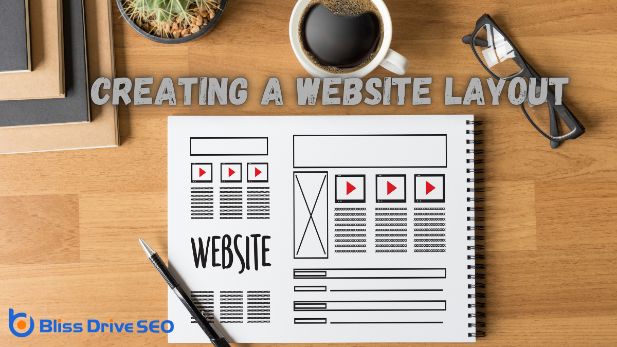
When you're designing with wireframes, you'll quickly see how they help visualize the layout and functionality of your website before moving into the detailed design phase.
There are plenty of tools available, like Figma and Adobe XD, that can make wireframing intuitive and efficient.
Before diving into the intricate details of web design, wireframing offers a powerful way to visualize the structure and functionality of your site. By creating a simplified blueprint, you can map out the layout without getting bogged down with colors, fonts, or images. This clarity helps you focus on the overall user experience, ensuring that essential elements are positioned effectively to guide visitors through your site.
Wireframing also encourages collaboration and feedback early in the design process. By presenting your wireframeA basic visual guide used in web design to suggest the structure and layout of a webpage. to stakeholders, you can gather input and make necessary adjustments before investing time and resources into development. This collaborative approach minimizes misunderstandings and keeps everyone aligned with the project's goals.
Moreover, wireframes save you time and effort by identifying potential issues in the design phase. Spotting problems early means fewer revisions later. With a clear visual guide, developers can translate your ideas into a functional site more efficiently.
Lastly, wireframing helps manage scope and set realistic expectations. It provides a tangible reference point to discuss what's feasible within your timeline and budget. By starting with wireframes, you lay a solid foundation for a successful web design project.
In the domain of web design, efficiency is key, and that's where wireframing tools come into play. These tools help you visualize the structure of your website before diving into detailed design and development. By using wireframing tools, you can create a blueprint of your website, allowing you to map out user flows and decide on the placement of elements without getting bogged down in aesthetics.
To get started, consider tools like Figma, Adobe XD, and Sketch. Figma is known for its collaborative features, making it ideal if you're working with a team. Adobe XD offers an intuitive interface and seamless integration with other Adobe products, which is great if you're already familiar with their ecosystem.
Sketch, on the other hand, is a favorite among Mac users, offering a versatile platform for both wireframing and high-fidelity design. If you're looking for something more straightforward, Balsamiq provides a simple drag-and-drop interface, focusing on low-fidelity wireframes to keep things basic.
Whichever tool you choose, make sure it aligns with your workflow and project needs. With the right tool, wireframing becomes a breeze, setting a strong foundation for your website's design process.
Having selected the right wireframing tool, the next step is to follow best practices to ensure your designs are both effective and efficient.
Begin by keeping your wireframes simple. Focus on layout and functionality without getting bogged down by colors or fonts. This helps stakeholders concentrate on structure, not aesthetics.
Next, use annotations. Clearly label elements and describe their intended functionality. This assures everyone involved in the project understands the purpose of each component. Annotations can prevent miscommunication and save time in later stages.
Don't forget to iterate. Your first draft likely won't be perfect, and that's okay. Gather feedback early and often from team members and stakeholders. Their insights can highlight areas for improvement you might've missed.
Another tip is to prioritize user experience. Always design with the user in mind. Consider how they'll navigate through your website and ensure the flow is intuitive.
Lastly, define a hierarchy. Establish a clear order of importance for elements on each page. This guides users' attention to key information first, enhancing their overall experience.

Choosing the right color and fonts is essential in defining your website's personality and guaranteeing a user-friendly experience. Start by considering your brand's identity. Colors evoke emotions; blue can convey trust, while red can create excitement. Select a primary color that aligns with your brand, and choose complementary colors for accents. Use online tools like Adobe Color to find harmonious color schemes.
When it comes to fonts, readability should be your priority. Pick fonts that are clear and easy to read across different devices. Sans-serif fonts like Arial or Helvetica often work well for body text, while serif fonts like Times New Roman can add elegance to headings. Limit yourself to two or three fonts to maintain a cohesive look.
Make certain your text contrasts well with your background to avoid straining your users' eyes. Test your colors and fonts to confirm they look good on various devices and screens.
To guarantee your website looks great on any device, focus on optimizing for different screen sizes.
You should implement flexible grids that adjust gracefully, providing a seamless user experience.
This approach will help your content remain accessible and visually appealing, no matter the user's screen.
Adapting your website for various screen sizes is crucial in today's mobile-centric world. Your visitors use a range of devices, from smartphones to large desktop monitors, and you need to guarantee a seamless experience on each one.
Failing to do so can result in frustrated users and lost opportunities. Here's how you can optimize your site for different screen sizes:
After guaranteeing your site adjusts well to different screen sizes, it's time to focus on implementing flexible grids to further enhance mobile responsiveness. Flexible grids are essential because they allow your website to adapt seamlessly to various devices, maintaining usability and aesthetics.
Start by using relative units like percentages instead of fixed units like pixels. This makes your design fluid, allowing content to resize based on the screen width.
You can leverage CSS frameworks like Bootstrap or Foundation, which offerThe specific product or service being promoted by affiliates. grid systems that simplify the process. These frameworks provide predefined classes and structures, helping you create layouts that are both responsive and consistent across different browsers.
Remember, a grid system divides your page into columns, and content can span multiple columns, adjusting automatically according to the screen size.
Think about using media queries to apply different CSS rules depending on the device's characteristics, like width. This guarantees that your flexible grids function efficiently across all devices.
Don't forget to test your layout on multiple devices to catch any inconsistencies. By implementing flexible grids, you enhance user experience, making your site more accessible and engaging for mobile users.
As you wrap up designing your website layout, it's crucial to immerse yourself in testing and gathering feedback to guarantee everything functions smoothly.
Begin by ensuring your website looks and behaves well across different devices and browsers. This step will help you identify any inconsistencies or issues early on. Remember, a seamless user experience is key to keeping visitors engaged.
To effectively test and gather feedback, follow these steps:
You've got the tools to create an effective website layout. Start by understanding your goals and audience, then choose a layout style that fits. Plan your site structure carefully and use wireframes to bring your ideas to life. Select colors and fonts that resonate with your brand, and guarantee your design is mobile-responsive. Finally, everything must be tested, and feedback must be gathered to refine the user experience. With these steps, you'll create a website that meets users' needs and achieves your objectives.


