Digital Marketing Services
Learn More About Us

When it comes to boosting landing pageThe web page a user is directed to after clicking on an affiliate link, optimized for conversions. engagementThe interactions that users have with a brand’s content on social media., you've got to start with compelling headlines that grab attention and clearly convey value. However, that's just the beginning. Optimizing your page load speed is essential since even a minor delay can hurt conversionThe completion of a desired action by a referred user, such as making a purchase or filling out a fo... rates. Authentic images and simplified navigation further enhance user experience and build trust. And let's not forget the importance of clear CTAs, mobile optimizationDesigning and formatting web content to ensure it performs well on mobile devices., and strategic use of color psychology. Each of these elements plays a key role, but how do you effectively integrate them to maximize your impact?

A significant headline is the gateway to capturing visitor attention and driving conversions on your landing page. Crafting headlines that engage and inform can boost your landing page engagement by up to 73%.
To make your headlines significant, focus on being short, practical, and benefit-focused. Including terms like "free" or "exclusive" can make a notable impact, immediately drawing the visitor's eye and piquing their interest.
Your headline sets the tone for user engagementThe level of interaction and involvement users have with social media content., acting as the first impressionWhen an ad is displayed on a user’s screen. of your content. A benefit-focused headline can increase click-through rates by up to 40%, making it vital to highlight what the visitor will gain.
For example, instead of a generic headline like "Learn More," opt for something more specific and enticing, such as "Discover Exclusive Tips to Boost Your Sales."
Clarity and conciseness are key. Visitors often skim content, so your headline should convey the main benefit quickly and effectively. By crafting clear, concise headlines, you confirm that visitors immediately understand the value of sticking around, setting the stage for deeper engagement and higher conversions.
After crafting compelling headlines, the next step to enhancing landing page engagement is to optimize page load speed. It's vital because a one-second delay can leadA potential customer referred by an affiliate who has shown interest in the product or service but h... to a 7% reduction in conversion rates. Users expect a web page to load in 2 seconds or less, and mobile users are even more impatient, with 53% abandoning a page that takes longer than 3 seconds to load.
To improve your landing page design and boost conversion rates, you should consider these key strategies:
Optimizing page load speed not only enhances user experience but also reduces bounce rates and boosts engagement. Remember, Google considers page speedThe time it takes for a webpage to load, affecting user experience and conversion rates. an important factor in SEO, making it crucial for your landing page design.
Utilizing authentic images on your landing page builds trust with users and enhances your site's credibility. When visitors see real, natural images, they feel a stronger and more genuine connection to your brand. Authentic images convey honesty and reliability, essential factors in establishing user trust.
Rather than relying on generic stock images, consider conducting a photoshoot to capture original images that reflect your brand's unique personality. This effort can greatly improve your page's appeal, making it more relatable and engaging for your visitors. Authentic images remind users that there's a real team behind the scenes, fostering a sense of transparency and reliability.
Incorporating real images can have a profound impact on user engagement on your landing page. When users see familiar, human elements, they're more likely to interact with your content and spend more time exploring your offerings. This increased engagement can lead to higher conversion rates and a more loyal customer base.
Building on the trust established through authentic images, streamlining your navigation can further enhance user engagement on your landing page. When you simplify navigation, you provide clear paths for users to follow, making their experience seamless and enjoyable. A well-structured, engaging landing page can reduce bounce rates and keep users focused on your primary goal.
By limiting navigation options, you prevent users from feeling overwhelmed and guarantee they stay on track. A sticky navigationA navigation bar that remains visible as users scroll down a webpage, improving usability. bar keeps essential links accessible, improving user navigation and enhancing the overall experience. When users can easily find what they're looking for, your conversion rates are likely to increase.
Here are some actionable tips to streamline navigation on your landing page:
When you're crafting CTAs, use action verbs to motivate users to take the next step. Make sure your buttons stand out by using contrasting colors for maximum visibility. Positioning your CTAs strategically and testing different variations can greatly boost engagement and conversions.
In today's digital landscape, using action verbs in your calls to action (CTAs) can be a game-changer for landing page engagement. Action verbs like "Get Started," "Download Now," or "Sign Up" have been shown to increase click-through rates by up to 90%. By incorporating these powerful words into your CTA button, you create a sense of urgency that encourages visitors to take immediate action.
Studies reveal that CTAs with action verbs outperform generic CTAs by up to 121% in conversion rates. This isn't just a minor tweak; it can considerably boost your engagement metricsMetrics that measure user interaction with a website, such as time on site and pages per session.. Clear and specific CTAs help guide visitors toward the desired action, effectively driving them to convert.
Consider these benefits of using action verbs in your CTAs:
Incorporating action verbs into your CTAs can substantially impact user behavior, leading to higher engagement and improved conversion rates.
Creating a high-contrast CTA button is essential for grabbing your visitors' attention and driving engagement. When you use high difference colors for CTAs, you make them stand out on the landing page, ensuring they don't get lost in the background. Studies show that CTAs with high difference have higher click-through rates, which means more of your visitors are taking the desired action, whether it's signing up, purchasing, or downloading.
Difference effectively directs user attention toward the CTA, making it crystal clear where they need to click. This can significantly increase engagement, as users are naturally drawn to elements that pop visually. Implementing clear CTAs with contrasting colors isn't just about aesthetics; it's a strategic move that can improve your conversion rates.
To find the most effective CTA design, consider A/B testingA method of comparing two versions of a web page or app against each other to determine which one pe... different difference combinations. This way, you can determine which colors work best for your audience, ensuring the highest possible click-through rates.

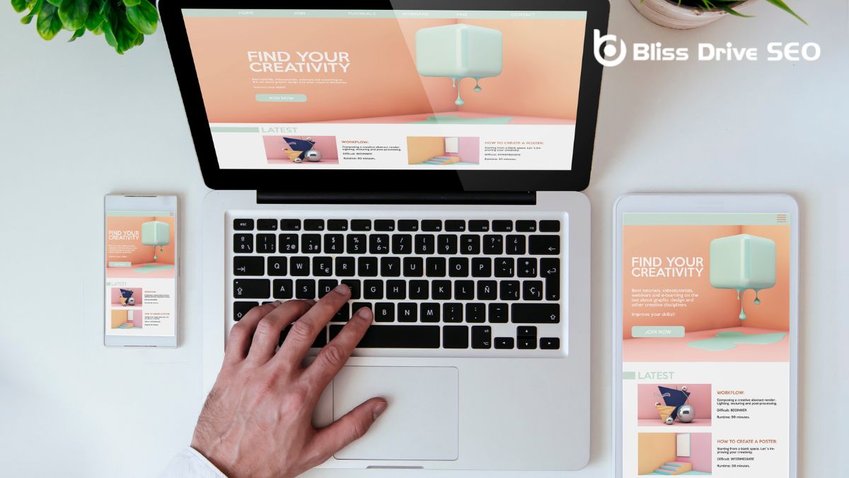
To enhance your landing page engagement, focus on responsive designA web design approach that makes web pages render well on a variety of devices and window or screen ... principles and optimize loading speed for mobile users. Over 60% of internet traffic comes from mobile devices, making these factors essential.
Use Google's free tool to make sure your page is mobile-friendly and effectively guide visitors through your content.
Given that over 60% of internet traffic now comes from mobile devices, embracing responsive design principles is crucial for enhancing your landing page's mobile experience. Utilizing responsive design guarantees that your site adjusts seamlessly to various screen sizes, improving user engagement and satisfaction. Mobile optimization isn't just a trend—it's a necessity.
Here's how you can make your landing page mobile-friendly:
While responsive design ensures your landing page looks great on any device, optimizing loading speed is just as important for keeping users engaged. Did you know that 53% of mobile site visitors will abandon a page that takes more than 3 seconds to load? The slow loading speed can harm user engagement, making mobile optimization vital.
To enhance your landing page's performance, you should aim for a quick loading timeThe time it takes for a webpage to fully load, affecting user experience and conversion rates.. A fast-loading page not only retains visitors but also boosts your conversion rates by up to 7%. This makes the optimization of loading speed a crucial strategy for any business looking to improve user experience and drive conversions.
Additionally, Google's mobile-friendly testA tool that evaluates how well a website performs on mobile devices. tool can be invaluable. It helps you ensure your landing page meets mobile optimization standards, which is essential since 57% of users won't recommend a business with a poorly designed mobile site.
Faster loading times also benefit your SEO rankingsThe position at which a website appears in the SERP., leading to increased visibility and engagement.
Color psychology is a powerful tool that can greatly boost engagement on your landing page. By understanding how different colors influence visitor emotions and behavior, you can strategically design your landing page to maximize engagement.
Using the right color palette can guide visitors' focus, enhance readability, and drive desired actions. For instance, blue often symbolizes trust and security, making it ideal for financial or tech-related landing pages. On the other hand, red can create a sense of urgency or excitement, which is perfect for promotional offers or limited-time deals.
Here are some key tips to leverage color psychology effectively:
How can I use visuals to increase engagement on my landing page?
Visuals play a crucial role in drawing attention and making content more digestible. To enhance engagement through visuals:
What role does page load speed play in landing page engagement?
Page load speed is critical for first impressions. If a page takes too long to load, users may lose interest and leave before engaging with the content. To optimize load speed:
Can personalizationTailoring content and offers to individual users based on their behavior, preferences, or demographi... techniques improve landing page engagement?
Yes, personalization can significantly enhance user engagement by making the experience more relevant to individual users. Techniques include:
What are the best practices for using testimonials on a landing page?
Testimonials can build trust and credibility, which are vital for engaging new users. Best practices for using testimonials include:
Enhancing your landing page engagement is all about understanding and addressing your visitors' needs. By crafting compelling headlines, optimizing page load speed, using authentic images, simplifying navigation, implementing clear CTAs, enhancing the mobile experience, and leveraging color psychology, you'll create a more engaging and conversion-friendly landing page. Start applying these tips today, and watch your engagement and conversion rates soar. Remember, small changes can make a big difference!
