Digital Marketing Services
Learn More About Us

Search Engine Optimization (SEO) is crucial if you want your site to be found by your target audience. Optimizing your landing pages will make them show up higher in search engine rankingsThe position at which a website appears in the SERP., resulting in more visitors. Sixty-eight percent of online experiences begin with a search engine, and fewer than one percent go beyond the first page.
If you want to succeed long-term, you must turn your website into a lead magnetA free resource offered in exchange for a user's contact information, such as an ebook or webinar.. And to do that, you should perform landing page optimizationImproving the design and content of a landing page to increase conversions..
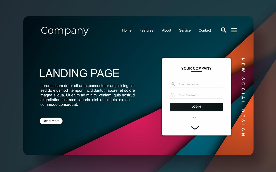
A landing page is a webpage designed to convert visitors into leads or customers. It is usually the first page that a visitor will see when they click on an ad or link, and it typically contains a form or Call-To-Action (CTA) that encourages the visitor to take some action.
While landing pages are often overlooked in the design of a website, they can be highly effective in generating leads and driving conversions. Here are several ways to ensure you create a highly converting and stunning landing page.
Your landing page is an excellent opportunity to tell your visitors about promotions and new discounts. However, most people showcase many items, which often causes visitors to be distracted and leave.
Define your landing page's goal before starting with an optimization. The goal should be clear and focused.
Create content that sounds genuine and provides informative value to your audience. Don’t be too promotional or lengthy. Your content should be catchy and value-packed. It should leave your reader wanting to do business either by purchasing your product or taking advantage of your service. There should only be a subtle push at the end to get them to do your desired action.
Headlines are the first things that capture your reader's attention. Well-written ones are short and catchy. Long headings confuse readers and get them disinterested. Create subheadings to break down long text sections and make your page readable. Headlines also help your landing page appear organized.
A compelling copy isn’t enough. Utilize call-to-action buttons to persuade customers to take action. These buttons are strategically placed within the landing page and have contrasting designs to make them stand out. The header, somewhere in the middle, and the bottom are great places for a CTA button. Make sure their messaging creates a sense of urgency.
Visitors are frustrated when pages take a long time to load and will quickly move on to a different site. Search engines also consider loading speed as a ranking factor. Look at your landing page's elements and ensure they’re optimized to load quickly. Google’s PageSpeed Insights is a great resource to help determine page load speeds.
Videos are highly visual and engaging and cause users to stay longer on your landing page. You can communicate a lot with a short video, and customers are more likely to convert when they like what they see. Just ensure that the videos you use are relevant to your customers.
Testimonials provide social proofThe influence that other people’s actions have on one's own behavior, often seen in likes, shares,... that other users have found your product or service beneficial. They are solid motivators for your visitors to try whatever you’re offering. Ask your loyal customers for testimonials and, ideally, get them to talk about how your product has changed their lives. Be careful to use authentic testimonials and not embellish them.
Visual consistency is important with all your materials. It helps ensure you remain brand across your materials and prevents customers from getting confused. The style, colors, and imagery they see on any running ad should match what they see on your landing page.
When including forms, make sure they are short and easy to accomplish. Customers may lose patience with lengthy forms. If you can’t avoid them, break them up into chunks and show a progress barA visual indicator that shows users their progress towards completing a task, such as filling out a ... that lets visitors know how many more questions they have to answer.
Text-heavy landing pages are tedious and hard to consume. Include infographicsVisual representations of information, data, or knowledge intended to present complex information qu..., animations, and images to keep your landing page interesting and vibrant. Your graphics should be relevant to your text and increase your content’s value.
Every business should utilize a highly optimized landing page to bring their business to the next level. Following the tips above, you can create visually appealing landing pages that rank in search engines and convert visitors. Not only will you enjoy a beautiful website, but you’d also benefit from increased leads and higher revenues.
Learn more about creating high-converting websites with our blogs at Blissdrive.
