Digital Marketing Services
Learn More About Us
There’s a reason everyone has a smartphone. Not only are smartphones the go-to tool for keeping in touch with family and friends, but they are quickly replacing the device that was once dominant in Internet browsing: the desktop computer — and by extension, the laptop computer.
According to Statista, mobile browsing now accounts for approximately half of all website traffic worldwide. This statistic has stayed at about 50% since 2017.
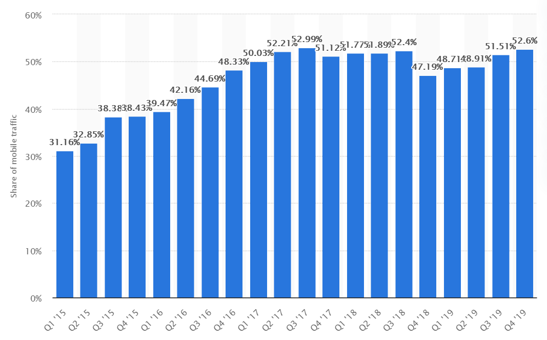
In the United States, that percentage is even higher. ZDNet reported in February 2020 that 3 out of 5 Americans use a mobile device first when surfing the web. They also revealed that 52% of online shoppers purchased through a mobile device.
This shouldn’t be that surprising. It’s much easier to sit back in your armchair and browse the web on your phone than it is to boot up your computer or laptop. Who wants to click with a mouse when you can just tap with your finger?
But this trend also has huge implications for your business, especially if you rely on your website to attract customers, generate leads, or make sales. If you haven’t done so already, it’s past time for you to adapt your website for Mobile SEOOptimization techniques to ensure a website performs well on mobile devices..
If you don’t know what mobile SEO is or if you’re unsure if your website is optimized, don’t sweat it. This guide from Bliss Drive expert team will walk you through the basics of how to optimize websites for mobile devices.
Mobile SEO is two things in one. It’s search engine optimization (SEO) combined with a form of website development that generates a flawless viewing experience on mobile devices. In other words, it applies the best practices of SEO concerning your website, but specifically to how people can find and view it on their smartphone.
Most other Internet companies have already adapted to the mobile trend. Google (which is basically synonymous with the Internet these days) is one company that pushed hard for mobile-first optimization.
Google now uses what it calls “mobile-first indexingGoogle’s practice of using the mobile version of a website for indexing and ranking.,” which means the search engine “predominantly uses the mobile version of the content for indexingThe process of adding web pages into a search engine's database. and ranking,” rather than the desktop version of the content of your website - this is mobile SEO.
That means that if your website doesn’t load properly or contains missing content when it’s viewed on mobile, Google won’t index it properly — it doesn’t matter how well it’s been structured for desktop.
Naturally, this can have huge implications for your site’s Google ranking. You’ve put a lot of time and money into your website. It would be a shame for all of that to go to waste just because it isn’t mobile optimized.
As a first step, just see how your website looks and feels on your mobile device. You can also use the following tools to test your webpage’s load speed and see how it looks on different types of mobile devices:
If content is missing, if images aren’t loading, if the text is so small it’s unreadable, and if it’s taking too long for content to load, your website will need some attention.

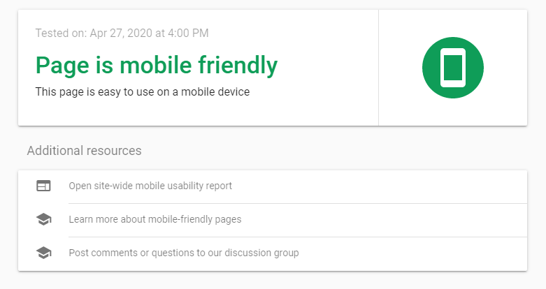
You can also check to see if specific webpages are generally mobile-friendly by using Google’s Mobile-Friendly Test for Mobile SEO tool on Google Search ConsoleA tool by Google that helps monitor and maintain your site's presence in search results.. Just plug in the URL, and after a brief analysis period, you’ll get your results.
Hopefully, they should look something like this:
If not, your first objective should be to adapt your site so that it works on mobile devices. There are a few ways to do this, but one method is now preferred over the others: using mobile-responsive design.
Most website building platforms and WordPress themes are now designed to be mobile-responsive. In fact, it’s rare to find one that isn’t. When your website is mobile-responsive, no matter what content you put on your site, it should rearrange itself to fit neatly and logically when being viewed from a smaller screen, such as that of a smartphone or tablet.
In the past, developers would build a “mobile version” of their website to be served dynamically to mobile users, or they would create a separate URL that their site would redirect to when being accessed by a mobile phone. While these two routes technically work, they aren’t good for your mobile SEO.
According to the Search Engine Journal, there is no separate Google Index for mobile, so only the “desktop version” of your website would be indexed, and it wouldn’t be mobile-optimized. Furthermore, Google wouldn’t register that your website is mobile-friendly, which could hurt you in search rankingsThe position at which a website appears in the SERP..
If you’ve created or updated your website recently, you may already be covered. But if you’re using an older website builder or if you hard-coded your website from scratch, you may not have a mobile-responsive design.
Altogether, there are three ways to make your website mobile responsive.
Again, very few WordPress themes aren’t mobile-responsive these days. But if you’ve got one of them, it’s probably time to move on.
This may require you to do some redesign work, but it’s the easiest way to avoid any hiccups when making the switch. The alternatives are to transfer your website to a new platform, or start a new website from scratch.
You can use HTML and cascading style sheets (CSS) to automatically resize, hide, shrink, and enlarge objects on your website. This code only works with a mobile-responsive design and may be necessary if your theme or website building platform doesn’t insert it automatically.
Just insert the following <meta> element to the head of the HTML on all your webpages:
<meta name="viewport" content="width=device-width, initial-scale=1.0">
This instructs the website browser to scale the page’s dimensions based on the size of the user’s screen. If your website isn’t built to be mobile SEO responsive in the first place, this could make the user experience worse if you don’t address the sizing of every element on the page.
For example, images that are displayed with a width wider than the user’s screen will force the user to zoom out or scroll horizontally just to see the entire webpage.
To make an image scale as well, you can set the CSS “width” property to 100%, like this example with “img_1.jpg”:
<img src="img_1.jpg" style="width:100%;">
This will make the image scale either larger or smaller than its original size to fit the screen. Naturally, you don’t want your image to appear giant on your user’s mobile screen. To avoid that possibility, just add the “max-width:100%” property, which allows the images to scale down but not up:
<img src="img_1.jpg" style="max-width:100%;height:auto;">
You can do the same thing with text by adding HTML as well. Here’s how you can scale an H1 tagThe main heading tag in HTML, important for SEO and indicating the primary topic of a page. to “viewport width” or “vw”:
<h1 style="font-size:10vw">Header Text Here</h1>
If you don’t have a mobile-responsive theme, you may have other elements on your website that require your attention, such as buttons and widgets. You may need to add code to each of these elements to make them size correctly on various screen sizes.
If your website is still being hosted by a platform that looks like it hasn’t been updated since 2002, it might be time to find a new home on the Internet for your business. If your current website builder or hosting service doesn’t give you the tools you need to make your website mobile-responsive, they probably aren’t worth your time and money anyway.
The good news is that you should be able to keep your domain.
Do your best to save all your content when making the transfer. You may be able to export your site or even transfer it to a new platform automatically.
Beyond mobile responsiveness, there are a few other elements of mobile SEO you may need to address on your website. Here’s what you can do, step by step.
If you haven’t already, try running your homepage through Google’s PageSpeed Insights tool. If you end up with a low speed score, the tool will provide you with plenty of information about what’s slowing your page down.
You can repeat this step for all your webpages to get an idea of which elements are slowing down your website on mobile devices.
You’ll see a detailed examination of what’s making your website slow in the “Lab Data” section. It might look something like this:
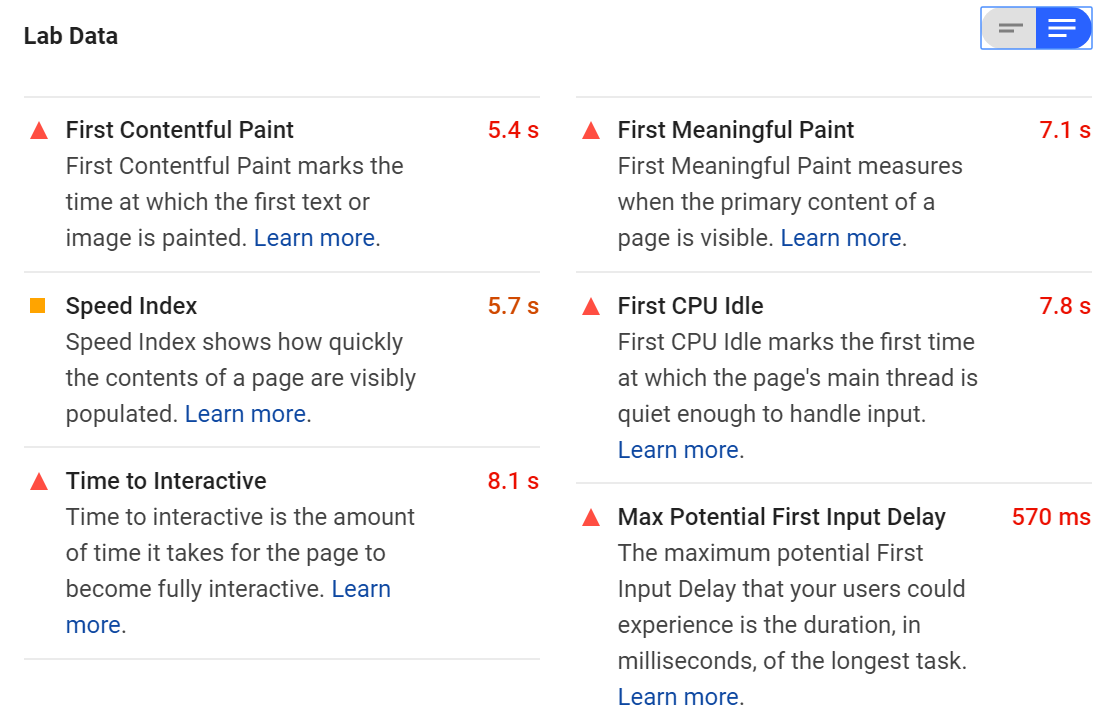
The tool will also provide you with a list of “Opportunities” below this. These are all the things you can do to make your website load faster on a smartphone. Some of the changes you need to make may involve altering the way you deliver critical JavaScript and CSS.
You may also need to reduce the impact of third-party code on your site or implement HTTP caching to speed up your load time when people visit your website repeatedly. If you need help, you may want to reach out to some experts to work on your website for you.
There are a few other tricks to reduce load times. One of the most basic is to reduce the “weight” of your webpages by literally minimizing the number of bytes that need to be loaded.
You can do this by compressing images and optimizing other assets like videos. You can even combine your images into CSS sprites to make them load faster. You can do these things manually, or you can use tools that do them automatically (there are tons of compression plugins available for WordPress).
If possible, consider uploading images in newer formats like JPEG-XR or WebP rather than GIF, PNG, or JPEG. These formats are better optimized for mobile viewing.
Meanwhile, instead of using a plug-in to play videos, consider using HTML5 by implementing the <video> and <source> elements where you want the video on the page. It should look like this:
<video controls>
<source src="movie.mp4" type="video/mp4">
<source src="movie.ogg" type="video/ogg">
</video>
The three video formats supported by HTML5 are MP4, WebM, and Ogg.
We’re not going to wade into the pop-up debate too much, but if you use pop-ups on your website, you should be aware that they can impact your mobile SEO.
Originally, webmasters may have suggested you disable pop-ups complete for mobile viewers. More recently, Google has announced that some types of pop-ups won’t hurt your rankings, but others do.
Mainly, Google wants website owners to do away with what it deems “intrusive” pop-ups. These are usually pop-ups that take up the entire screen on a mobile device or otherwise make it difficult to access content on a smartphone.
According to the Google Webmaster Central Blog, techniques that make content less accessible include the following:
Showing a pop-up that covers the main content immediately after the user accesses the page or while they’re browsing.
Displaying a standalone pop-up that must be dismissed before the user accesses the main content.
Using a layout where the main content has been inclined beneath the fold and the above-the-fold content appears similar to the standalone pop-up.
Generally, if your pop-ups look like this on mobile, Google will penalize you for it:
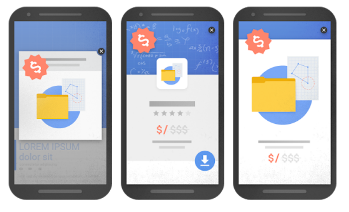
Google does ignore some pop-ups that fit these descriptions if they are necessary. For example, some websites are legally obligated to inform users that they use cookies or verify the user’s age before they can access the site. Small banners that are easy to dismiss are generally okay, too.
So, if you’re going to have non-essential pop-ups on your website experience, make sure they are small, non-intrusive, and easy to recognize and dismiss for a nice mobile SEO experience, like this banner on the top of the webpage below:

Developers used to block certain resources from mobile users — and, by extension, from Google’s crawlers. For example, they might block some written content to keep the page shorter or block some JavaScript from loading. This would make the website load faster and be easier to use on a smartphone.
This wasn’t a bad instinct because it did make the mobile experience better. Who wants to wait for JavaScript to load when all you want to do is read an article?
The problem with this approach these days is something we’ve already mentioned: Google’s mobile-first indexing technique. Whatever resources and content don’t appear on your mobile site won’t be crawled by Google. As far as the search engine is concerned, those assets probably don’t even exist for mobile SEO.
As we mentioned above, there are other ways to make your website load faster. Ensure you aren’t blocking any resources, such as JavaScript, CSS, images, and video for mobile users. Let Google crawl everything and let users see everything on your website.
If you can’t build a strong mobile experience with what you have, it may be time to take a second look at your design. If you absolutely need to block content or resources on your site, make sure they aren’t critical to your users.
The term “accessibility” doesn’t just refer to how quickly your website loads or how easy it is to navigate. According to the World Wide Web Consortium (W3C), putting accessibility into practice “is essential for developers and organizations that want to create high-quality websites and web tools, and not exclude people from using their products and services.”
If the Internet is for everyone, that means it needs to be accessible to people with disabilities too. Accessibility isn’t just an important ethical decision, it’s also an important business practice. Google will penalize websites that aren’t accessible.
Luckily, many of the aspects of mobile SEO overlap with accessibility. For example, all the following are elements of good mobile SEO, but they also exist to enhance your site’s accessibility:
Image alt attributes work with screen-reading technology to describe images to users who are visually impaired. Video transcriptions make videos more accessible to people who are hard of hearing. On-site sitemaps and easy navigation tools make it easier for people who use voice commands to browse your website.
Start by looking at the way your pages appear on mobile. Are you using negative space to make it easy to identify content? Is your typeface large enough to read on the screen?
You should also pay attention to your image alt attributes and captions. If someone with a screen reader hears the alt attribute attached to one of your images, will they understand what is being depicted, or will they hear something like “image underscore seven three two one dot jpeg?”
Keep in mind that you’ll need to optimize your website for all sorts of devices, whether they are a phone, a tablet, or an AI assistant device.
There are also other areas of accessibility that you won’t be able to cover just by optimizing your website for mobile. To ensure your website is accessible, follow the Web Content Accessibility Guidelines (WCAG).
Finally, you should follow general Mobile SEO guidelines to ensure your website is optimized for mobile. That means installing Google Search Console, generating and submitting a sitemap, using keywordsWords or phrases that users type into search engines to find information., and adding structured data so it’s easy for Google to crawl your pages, among other strategies.
Check out some of our great mobile SEO and general SEO resources to learn more about on-page and off-page SEOOptimization actions taken outside the website, primarily involving backlinks and social media.:
If you can follow these steps, you’ll be well on your way to creating a mobile-optimized website that will look fantastic on any smartphone. Plus, Google will love you that much more.
For more information about Mobile SEO and mobile site optimization, reach out to our Mobile SEO experts at Bliss Drive.
Enjoyed this article? 👉 Read more: Breadcrumbs & SEO: What They Are & Why They Matter
