Learn More About Us

Imagine this: Your website is informative, attractive and practically begs visitors to explore everything you have to offerThe specific product or service being promoted by affiliates..
But despite this: No sales, No signups - Nothing!
The culprit can be a weak call-to-action (CTA). To improve your CTA, it is important to:
In this guide, let’s discuss the best CTA practices further. Read on for actionable insights to elevate your web design and online presence.
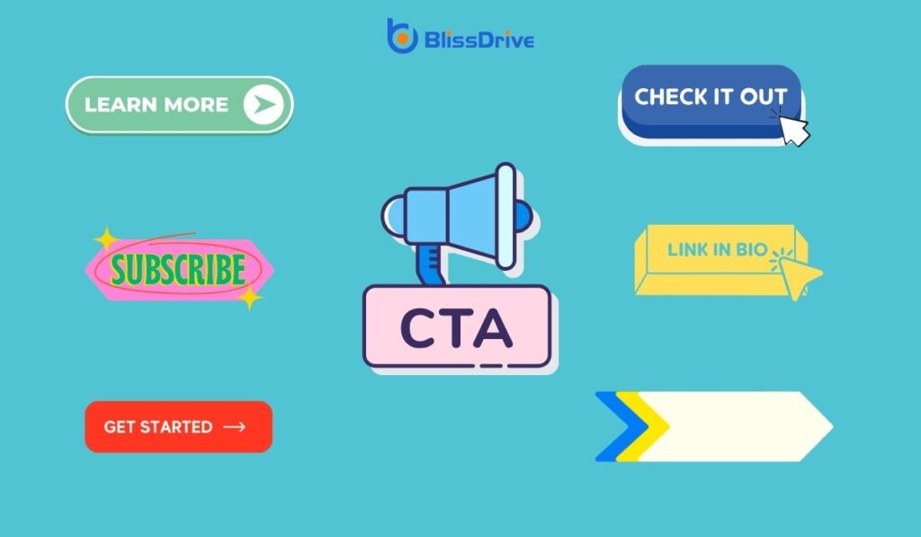
A Call-to-Action (CTA) is a prompt on a website that encourages users to take a specific action. This can be anything, such as signing up, purchasing, or downloading. The main goal of a CTA is to guide users toward achieving business goals.
CTAs blend design and content strategyA plan for creating, publishing, and managing content to meet business goals. to guide user actions. When well-optimized, they boost engagementThe interactions that users have with a brand’s content on social media. and increase conversionThe completion of a desired action by a referred user, such as making a purchase or filling out a fo... rates.
An optimized CTA can increase conversions—by as much as 232%.
However, optimizing a CTA is not only about improving its appearance. It should have the language, placement, and functionality to resonate with your audience.
Some ways to achieve the correct balance include:
To streamline your CTAs, start by simplifying the language. This means using clear, concise wording that speaks directly to the user’s needs. It should also remove any ambiguity about what action they should take.
For example:
Remember, clarity is key.
Use straightforward language that is easy to understand. Avoid jargon or complex phrases that might confuse the audience.
Enhancing your CTAs involves using verbs that compel action. Action-oriented verbs create a sense of immediacy and motivation. This urges the users to act.
Examples of action-oriented verbs for CTA include:
By using energetic verbs, your CTAs can drive engagement and increase conversions. This approach ensures that your messages prompt immediate responses from your audience.
To further streamline your CTAs, create a sense of urgency. About 60% of people make reactive purchases due to FOMO (Fear of Missing Out).
The time-sensitive offers and limited product availability encourages users to act fast. It prompts immediate action and facilitates rapid decision-making.
Highlight time-sensitivity and exclusivity with phrases like:
These phrases will pressure visitors to take advantage of offers before they disappear. Ultimately, the irresistibility of your offer will increase conversion rates.
The placement of your Call-to-Action helps maximize visibility and effectiveness. Strategic positioning can influence user engagementThe level of interaction and involvement users have with social media content. and conversion rates.
Different colors can evoke specific emotions and actions. Thus, the colors are a powerful tool in designing CTAs.
For example:
To ensure your CTAs stand out, use colors that contrast with the background of your webpage. This will draw attention to your CTA and make your button recognizable, leading to clicks.

The shape and design elements of a CTA can also influence its effectiveness.
Integrating icons within buttons can enhance click-through rates:
Well-designed and appropriate shapes for your CTAs can influence user's actions. This will improve the look and functionality of your CTA to increase visitor interaction.
Customizing your CTAs based on audience segments can enhance their effectiveness.
To tailor the CTAs:
By understanding the needs, preferences, and behaviors of the audience, you can craft CTAs that resonate more with each group.
Incorporating CTAs into multimedia content, like videos, boosts their effectiveness. KISSmetric reports that embedding CTAs in videos can increase clicks by up to 380%.
This engaging method captures the viewer's attention, leading to prompt action. It increases the user experience by providing a seamless flow from content to action.
Don't neglect mobile optimizationDesigning and formatting web content to ensure it performs well on mobile devices. as there is a growing prevalence of mobile browsing. A mobile-friendly CTA needs to be clickable. This means you must consider the size, spacing, and positioning for touch interactions.
A few tips to follow when making your optimizing your CTAs for mobile include:
A mobile-friendly CTA boosts the likelihood of conversions from mobile users. After all, they represent a significant part of web trafficThe number of visitors to a website, often used as a measure of an affiliate's reach and influence..
A/B testing helps refine your CTAs to achieve the highest possible conversion rates.
This process involves comparing two versions of a CTA to see which performs better. This includes testing different elements like wording, color, placement, or size. The collected data can help you figure out the CTA that resonates best with your audience.
The A/B testing process includes:
Regular A/B testing ensures that your CTAs are always optimized for performance. It will also keep them effective and relevant to changing user preferences.
To boost your digital marketing, refine your CTAs for better engagement and conversions. Adopt innovative strategies and design tweaks.
Ensure your CTAs not only attract attention but also compel action.
Learn how implementing topic clusters can boost your search engine rankingsThe position at which a website appears in the SERP. in our next guide. Read now to start optimizing your content strategy today!
