
Digital Marketing Services

Learn More About Us

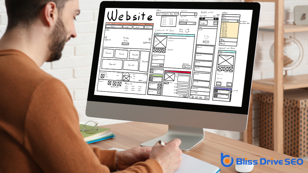
When you're designing a website layout, start by considering who your audience is and what they're looking for. You'll want to create a structure that guides them effortlessly through your content. Begin with a sketch to organize your thoughts and guarantee a balanced approach that doesn't overwhelm visitors. Don't forget mobile responsiveness—it's essential for today's users. Once you've got a draft, user testingObserving real users as they interact with a website to identify usability issues and areas for impr... will give you insights that can refine your design. But how do you choose the right colors and typography that align with your brand while enhancing user experience? Let's explore this further.
When it comes to creating an effective website layout, understanding your audience is essential. You want to guarantee that your site resonates with the people who visit it. Start by identifying who your audience is. Consider their age, interests, and needs. Are they tech-savvy individuals or beginners? This information will guide your design choices and help you create a more user-friendly experience.
Next, think about what your audience hopes to achieve by visiting your site. Are they looking for information, purchasing products, or seeking entertainment? Tailor your layout to meet these goals. For instance, if your audience values quick access to information, guarantee your navigation is intuitive and straightforward.
Place important content where it's easily accessible, reducing the need for excessive clicking or scrolling.
Engage with your audience through user testing and feedback. This can provide valuable insights into what works and what doesn't. Don't be afraid to make adjustments based on this feedback.

When choosing a color scheme for your website, start by understanding color psychology to influence how visitors feel.
Aim for color harmony to create a visually appealing and balanced experience.
Use tools like color pickers and palettes to simplify the selection process and guarantee consistency.
Colors are the paintbrushes of your website's personality, and understanding color psychology can help you choose a color scheme that resonates with your audience. Colors evoke emotions and can influence how visitors perceive your brand. By knowing the basics of color psychology, you can strategically use colors to communicate the right message.
Start by considering what emotions you want to convey. For instance, blue often represents trust and professionalism, making it a popular choice for corporate websites. Red is bold and can evoke excitement or urgency, which might be ideal for sales-driven sites. Green is commonly associated with nature and tranquility, perfect for eco-friendly brands.
Think about your target audience's cultural background, as color meanings can vary greatly across cultures. For example, white symbolizes purity and simplicity in some cultures, while in others, it might represent mourning.
Also, consider how your chosen colors work together to ensure they don't clash or overwhelm users. A well-thought-out color scheme can guide users effortlessly through your site, enhancing their experience and engagement.
Ultimately, understanding color psychology allows you to create a visually appealing and emotionally impactful website that aligns with your brand's values and goals.
Crafting a harmonious color scheme is vital for an aesthetically pleasing website that captivates your audience. To achieve this, start by considering the emotions and messages you want your website to convey. Different colors evoke different feelings, so aligning your choices with your brand's identity is fundamental.
For example, blue often represents trust and professionalism, while green can suggest growth and tranquility.
Once you've determined the emotions you wish to evoke, choose a primary color that will dominate your website. This color should align with your brand's core message. Next, select complementary colors to support your primary choice. These should enhance the primary color without overwhelming it, maintaining a balanced look.
Pay attention to contrast, as it plays a significant role in readability and user experience. Ascertain text stands out against the background to avoid straining your visitors' eyes.
Stick to a limited palette—usually three to five colors—to prevent the design from becoming chaotic. This approach guarantees a clean and organized appearance.
Lastly, test your color scheme across various devices and lighting conditions. This helps maintain consistency, ensuring your website looks great everywhere and keeps your audience engaged.
Selecting the perfect color scheme can feel like painting a masterpiece; it's both an art and a science. You want colors that resonate with your brand and evoke the right emotions.
Fortunately, several tools can help you choose the perfect palette for your website.
Start with Adobe Color, a powerful online tool where you can explore various color harmonies. It lets you generate palettes based on analogous, monochromatic, or complementary schemes.
Simply adjust the color wheel, and it provides you with RGB and hex codes, making implementation easy.
Another great tool is Coolors, which offers a more intuitive approach. Just hit the spacebar, and it generates a new color scheme instantly.
You can lock colors you like and keep generating until you find the perfect combination.
For those who prefer a curated experience, Color Hunt offers a collection of beautiful palettes created by a community of designers.
You can browse by popularity or newness and find inspiration in colors you mightn't have considered.
These tools don't just make color selection easier; they guarantee your site's colors are cohesive and visually appealing, enhancing user experience and engagement.
Typography is an essential element that can greatly influence your website's readability and overall aesthetic. Choosing the right fonts isn't just about style; it's about guaranteeing your visitors can easily read and navigate your content.
Start by considering your site's purpose and target audience. Different fonts convey different emotions and messages. For instance, serif fonts like Times New Roman often evoke a sense of tradition and reliability, while sans-serif fonts like Arial feel modern and clean.
When selecting typography, prioritize readability. Always test how your chosen fonts look at various sizes and weights. Remember, too many font styles can make your site look cluttered and disorganized. Stick to a maximum of two to three complementary fonts to maintain a cohesive look.
Pay attention to line spacing and letter spacing, as these can affect how text is perceived and the overall user experience. Tools like Google Fonts or Adobe Fonts offerThe specific product or service being promoted by affiliates. a wide selection of typefaces and provide previews, helping you see how fonts will appear on your site.
Finally, guarantee your typography is responsive. Your text should adapt well across different devices, maintaining legibility whether viewed on a smartphone or a desktop screen.
When planning your layout structure, start by defining key content areas to guarantee your website meets your goals.
Next, establish a visual hierarchyThe arrangement of elements on a webpage in a way that guides users' attention to the most important... that guides users naturally through your content, making it easy for them to find what they need.
Every successful website begins with a clear understanding of its key content areas. Before diving into design, identify what essential information your site needs to convey. Consider the primary goals of your website. Are you showcasing a portfolio, providing a service, or selling products? These goals will guide you in defining your key content areas.
Start by listing the sections that your website requires. Common sections might include a homepage, an about page, services or product pages, a blog, and a contact page. Each section should serve a specific purpose and support your overall objectives. Ask yourself what information your target audience seeks and how you can present it effectively.
Next, prioritize these content areas based on significance and user needs. Think about what visitors should see first and what'll engage them. It's vital to balance your content, ensuring it's not overwhelming but still thorough. Remember, less is more when it comes to web design.
Once you've outlined these areas, sketch a rough draft of your layout to visualize how they'll fit together. This step will help you plan a cohesive and user-friendly structure that makes sense to your audience.
With your key content areas defined, it's important to shift your focus to establishing a visual hierarchy in your layout. This hierarchy guides your visitors' eyes, helping them understand what's most important on your page.
Start by considering the size and placement of elements. Larger elements naturally draw more attention, so use them for key headings or calls to action. Position these elements where a visitor's eyes are likely to go first, typically the top left or center of the page.
Next, experiment with color and contrast to make important elements stand out. Bright or contrasting colors can emphasize specific areas, drawing attention swiftly.
Also, think about the use of white space. It might seem counterintuitive, but empty spaces around an element can highlight it by giving it room to breathe.
Typography also plays a significant role. Use different font sizes and styles to create a clear distinction between headings, subheadings, and body text. Confirm your most critical information is easily readable.
Finally, maintain a consistent style throughout your site to build a coherent experience, making sure each element aligns with your overall visual hierarchy. This approach will guide users naturally through your content.

Crafting a website layout that adapts seamlessly to mobile devices is vital in today's digital age. More people are browsing on their phones than ever before, and your design should reflect this shift.
Mobile responsiveness means your website looks and functions well on all screens, guaranteeing a positive user experience. Here's how you can achieve that:
Visual elements are essential in creating an engaging and aesthetically pleasing website layout. They not only capture visitors' attention but also communicate your brand's message effectively.
To start, choose a color scheme that reflects your brand identity. Consistent use of colors helps build recognition and should complement the content, not overshadow it.
Next, select high-quality images that resonate with your audience. Images can evoke emotions and help explain complex ideas quickly. Make sure they're relevant and properly optimized for faster loading times.
Icons are another great way to enhance navigation and guide users through your website. They should be simple and consistent with your overall design theme.
Typography also plays an important role. Choose fonts that are legible and visually appealing. Pair different font styles to create a hierarchy, making it easier for users to digest information.
Remember, less is more; avoid cluttering your design with too many fonts or images.
Lastly, consider using whitespace strategically. It helps create balance and focus, allowing users to navigate your site without feeling overwhelmed.
When designing a website, prioritize user experience to guarantee visitors have a seamless and enjoyable interaction. By focusing on the user's needs, you'll create a layout that not only attracts but retains visitors.
Start by making sure your site is easy to navigate. Clear menus and intuitive design leadA potential customer referred by an affiliate who has shown interest in the product or service but h... users effortlessly through your content. Remember, a frustrated visitor is unlikely to return.
Consider these four vital strategies to enhance user experience:
Testing is an essential part of the web design process that assures your site functions as intended and meets user expectations.
You'll want to start by conducting usability tests, which involve real users interacting with your site. These tests help identify any confusing elements or navigation issues. Remember, what seems obvious to you mightn't be clear to others. Pay attention to user feedback, as it often reveals insights you hadn't considered.
Next, functional testing is performed to confirm that all links, forms, and interactive features work properly. There's nothing more frustrating for users than broken links or non-responsive buttons. Make sure to test on different devices and browsers to ensure a consistent experience for everyone visiting your site.
Iteration is a key component of this process. Once you've gathered data from your tests, don't hesitate to make necessary adjustments. This might mean tweaking design elements, refining content, or even altering the layout.
Iteration isn't a one-time task but an ongoing effort to continuously improve your website. By embracing testing and iteration, you guarantee your site evolves with user needs, ultimately enhancing satisfaction and engagement.
In designing a website layout, always keep your audience at the forefront. Choose a color scheme and typography that resonate with them. Plan a layout that's both structured and adaptable for mobile devices. Don't forget to incorporate visual elements that enhance engagement. Prioritize user experience by making navigation intuitive and straightforward. Test your design with real users, gather feedback, and continuously iterate. By doing so, you'll craft a website that truly meets your audience's needs and expectations.


