

Learn More About Us
When you hear "CSS," you might think of web design, but there's more to it than meets the eye. It's not just about making things look pretty; it's about creating a seamless user experience by separating content from presentation. This separation allows for easier maintenance and consistent styling across different pages. But how did CSS evolve to become such an integral part of web development, and what are the core principles that guide its usage? As you explore these questions, you'll discover how CSS has shaped the way we interact with the digital world.
CSS, or Cascading Style Sheets, is a fundamental tool for web design that allows you to control the look and feel of a website. By using CSS, you can separate content from design, which means you can change the visual elements without altering the HTML structure.
This separation makes your web pages easier to manage and more flexible to update.
When you explore CSS, you'll notice it uses selectors to target specific HTML elements. These selectors let you apply styles like colors, fonts, and spacing. For instance, if you want all your paragraph text to be blue, you can simply write a rule in CSS that applies this color to every '
' tag on your site.
This ability to apply consistent styling across multiple pages saves you time and effort.
CSS isn't just about aesthetics. It also enhances user experience by making your site responsive. You can use CSS to adjust layouts for different devices, ensuring your website looks great on both mobile and desktop screens.
Mastering these basics empowers you to create visually appealing and user-friendly websites, making CSS an indispensable tool in your web design toolkit.
As you become comfortable with the basics of CSS, it's fascinating to explore how this powerful tool has evolved over time. CSS, short for Cascading Style Sheets, has undergone considerable changes since its inception in the mid-1990s. Initially, it provided a simple way to separate content from design, allowing for cleaner HTML. The first version, CSS1, laid the foundation, but its capabilities were quite limited.
With the introduction of CSS2 in 1998, the language expanded its reach, supporting media types and enhancing layout control. This version brought the ability to create more sophisticated designs, but inconsistencies across browsers often posed challenges for developers.
The real game-changer came with CSS3, introduced in the late 2000s. CSS3 revolutionized web design by adding modularity, which allowed individual features to be developed and adopted independently. This version introduced features like rounded corners, gradients, and animations, considerably improving the visual aesthetics of web pages.
Today, CSS continues to evolve with CSS4 and beyond, embracing new specifications and tools. The evolution of CSS reflects the ever-changing landscape of web development, providing you with more powerful tools to create dynamic and responsive designs.
It's an exciting journey that shows no sign of slowing down.
At the heart of mastering web design lies the core principles of CSS, which serve as the building blocks for creating visually appealing layouts. To truly harness the power of CSS, you need to understand these key concepts.
First, the concept of the "cascade" is crucial. It determines how styles are applied, with rules cascading from one style sheet to another based on specificity and importance. This means the most specific rule will take priority when conflicts arise.
Next, embrace the idea of "inheritance." Many CSS properties are inherited from parent elements to child elements, streamlining your styling process. By understanding which properties inherit by default, you can avoid redundant code, making your stylesheets cleaner and more efficient.
Another core principle is the "box model," which dictates how elements are structured and displayed on a web page. Every element is fundamentally a box consisting of content, padding, border, and margin. Grasping this concept allows you to effectively control spacing and layout.
Finally, understand "selectors" and how they target HTML elements. They range from simple tag selectors to complex attribute selectors, offering flexibility in styling your webpage. Mastering these principles empowers you to create consistent, maintainable designs.
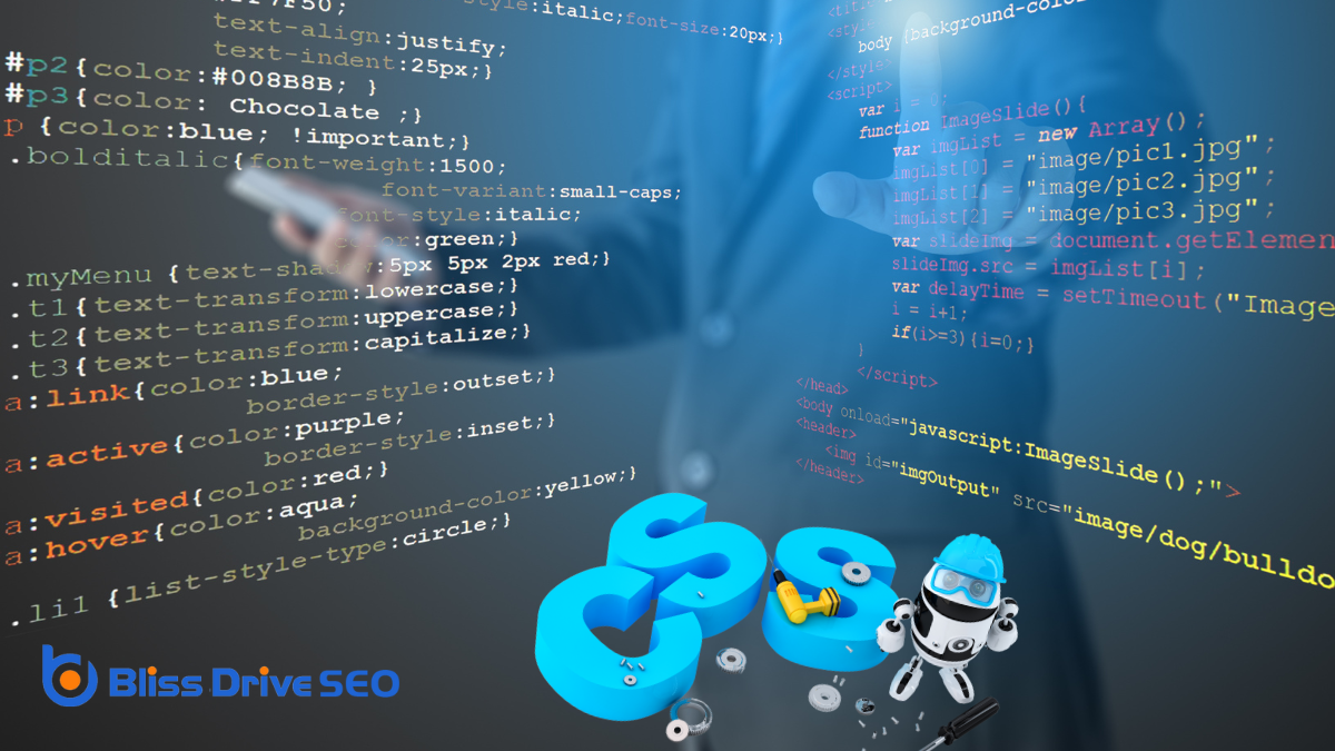
Building on the foundational principles of CSS and understanding its syntax and structure is the next step in mastering web design. At its core, CSS syntax is simple yet powerful. A CSS rule-set consists of a selector and a declaration block. The selector targets the HTML element you want to style, like a header or paragraph.
Following the selector, you'll find the declaration block, enclosed in curly braces, containing one or more declarations. Each declaration within the block consists of a property and a value, separated by a colon. For example, 'color: blue;' changes the text color of the selected element to blue. Remember to end each declaration with a semicolon to avoid errors.
The structure of CSS is hierarchical, meaning more specific selectors can override general ones, and later declarations can take precedence over earlier ones if they're equally specific.
You'll also encounter CSS comments, which help organize and clarify your code. Comments start with '/*' and end with '*/', which are ignored by browsers but are invaluable for keeping track of your styles.
With a solid grasp of CSS syntax and structure, you're well-equipped to create visually appealing web pages.
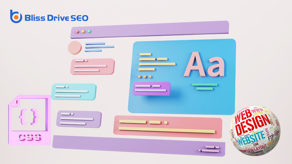
Diving into the world of styling with CSS transforms your web pages from plain text into visually enchanting experiences. CSS, or Cascading Style Sheets, lets you control the appearance of your HTML elements, giving you the power to adjust colors, fonts, spacing, and layout.
By writing CSS rules, you instruct browsers on how to display content, enabling you to create unique, attractive web designs. Start by defining styles for basic HTML elements like headings, paragraphs, and links. You can change font sizes, set background colors, or even add borders.
Using selectors, you target specific elements to apply your styles effectively. For example, class selectors can be used to style multiple elements with the same design, or ID selectors can be used for unique elements.
CSS also supports pseudo-classes and pseudo-elements, allowing you to style elements in specific states or parts of an element. Hover effects on buttons or custom styles for the first letter of a paragraph are achievable with these features.
Additionally, CSS provides tools like flexbox and grid layouts, helping you organize content in a visually appealing manner. By mastering these techniques, you'll enhance user experience and make your web projects stand out.
When you're working with CSS in responsive design, understanding media queries is essential.
You'll find that fluid grids play a vital role in ensuring your layouts adapt smoothly across different devices.
Media queries are a cornerstone of responsive design, allowing you to adapt your website's layout across different devices and screen sizes. When you use media queries, you're setting conditions that determine when specific CSS rules should apply. This means your website can look great on a smartphone, tablet, or desktop without requiring separate code bases for each.
To implement media queries, you start by specifying the type of media (typically "screen") and then define conditions, like minimum or maximum width. For example, you might write a rule that applies only when the screen width is less than 600 pixels. Inside these conditions, you can adjust styles like font size, layout, and image dimensions to guarantee your site remains user-friendly and visually appealing.
Understanding media queries will empower you to create more flexible and accessible web designs. They let you target different devices with precision, guaranteeing your content is presented in the best way possible, no matter the user's screen.
Building on the adaptive power of media queries, fluid grids play a significant role in responsive design by guaranteeing that your layout scales smoothly across various devices. Imagine your website as a liquid that flows into any container, effortlessly adjusting to fit different screen sizes. That's fundamentally what fluid grids do for your design. They use relative units like percentages rather than fixed units like pixels, allowing your elements to expand or contract based on the screen's width.
When you embrace fluid grids, you're not just making your site look good on every device; you're also enhancing user experience. Visitors won't need to zoom in or scroll horizontally because your content naturally reshapes itself to be easily readable and navigable.
Fluid grids work seamlessly with media queries to create a perfectly responsive design. While media queries adjust styles based on specific conditions, fluid grids guarantee that the core layout remains flexible.
This combination empowers you to build websites that maintain visual consistency and functionality, regardless of whether someone views them on a smartphone, tablet, or desktop. Embracing fluid grids is essential for delivering a seamless, user-friendly experience across the digital landscape.
In the world of responsive design, breakpoints are your roadmap to adaptability. They let you define how your layout should change at different screen sizes, guaranteeing your content looks great on devices ranging from mobile phones to desktops.
You'll use CSS media queries to set these breakpoints, making your design flexible and user-friendly.
Here's how you can effectively use breakpoints and layouts:
When you're ready to elevate your web design skills, mastering advanced CSS techniques is essential.
Start by exploring CSS Grid Layout to create complex, responsive layouts with ease, and enhance your designs further with responsive design strategies.
Don't forget to incorporate advanced animation techniques for engaging and dynamic user experiences.
Diving into the world of CSS Grid Layout Mastery, you reveal a powerful toolset for crafting complex, responsive web designs with ease.
CSS Grid transforms the way you approach layout design, offering a two-dimensional grid-based layout system that lets you place items into rows and columns.
By understanding its core concepts, you can elevate your web design skills remarkably.
To master CSS Grid, follow these steps:
Responsive design is vital in today's web development landscape, where users access websites from a myriad of devices. Whether it's a smartphone, tablet, or desktop, your site needs to adapt seamlessly. CSS provides powerful tools to guarantee your designs are responsive.
Media queries are your go-to. They allow you to apply styles based on device characteristics like width, height, and orientation. By using breakpoints, you can tweak layouts and guarantee content looks great on any screen.
Flexbox and Grid are also significant. Flexbox helps you create fluid layouts that adjust flexibly to available space, while CSS Grid offers a two-dimensional layout system that is perfect for complex designs.
Don't forget about relative units like percentages, ems, and rems. These units scale better across devices compared to fixed pixels.
Another strategy is responsive typography. Use CSS properties like vw (viewport width) to adjust text size dynamically. This way, your text remains readable, regardless of screen size.
Combine these techniques and test your designs on various devices to guarantee they perform well. By mastering these responsive design strategies, you'll create a more engaging, user-friendly experience.
Animations in CSS offerThe specific product or service being promoted by affiliates. a dynamic way to enhance user interactionAny action taken by a user on social media, such as likes, comments, shares, or retweets. and bring your designs to life. They can guide users through your site, emphasize important content, and create a more engaging experience.
Here's how you can take your animations to the next level with advanced techniques:
What does the future hold for CSS development? You'll see a focus on making the web more dynamic and accessible. CSS is evolving to meet the demands of modern web design, and you'll encounter exciting changes that simplify your work.
One key area is the advent of CSS Grid and Flexbox, which streamline responsive design, making layouts more intuitive and less cumbersome. These tools will only get better, offering even more flexibility.
You should also pay attention to new features like container queries. They allow styles to adapt based on the container's size, not just the viewport, giving you more control over design elements. This means no more relying solely on media queries to achieve responsiveness.
CSS Variables are another game-changer. They let you store values and reuse them throughout your stylesheets, reducing redundancy and making updates smoother. Imagine changing a primary color in one place and watching it update site-wide.
Lastly, the push towards CSS Houdini APIs promises to reveal custom styling capabilities. You'll be able to create and manipulate styles in ways that were previously out of reach, paving the way for more interactive, engaging web experiences.
Stay tuned; CSS is just getting started!
You've now got a solid grasp of CSS and its impact on web design. You've learned its basics, how it's evolved, and its core principles. With its syntax and structure, you can style content effectively and guarantee your designs are responsive across devices. As you explore advanced techniques, you'll see how CSS continues to evolve, promising exciting possibilities for the future. Keep experimenting and embracing CSS's power to create stunning, user-friendly web experiences.


